
The Giant Company
Streamlining multi-station food court ordering for the modern grocery shopper.
Company
Ahold Delhaize
Role
Product Designer
Duration
2020

Context
As the Primary Product Designer, I led the redesign of the kiosk ordering system for Giant Food Company’s flagship store in Philadelphia. The goal was to transform a complex, multi-station kitchen menu into a seamless, high-speed ordering experience that saves customers time during their grocery runs.
Problem
Client research showed that grocery shoppers often feel rushed or overwhelmed by long lines at prepared food stations. The existing system struggled to handle five distinct food brands (Sandwiches, Saladworks, Sushi, Taqueria, and Flatbreads) within a single interface, leading to high drop-off rates and user confusion.
Solution
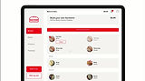
The redesigned Giant Kitchen Kiosk allows users to browse menus, fully customize "Build Your Own" (BYO) meals, and checkout via the "SCAN IT" app or at the counter.
Key Features


Market Research & Jakob’s Law
To ensure the UI felt intuitive, I analyzed competitors to leverage Jakob’s Law (users prefer your site to work the same way as all the other sites they already know).
Market Insights:
80% of competitors used "Eat in or Carry out" options.
60% used left-hand sidebar navigation for deep menus.
Only 20% offered a robust "Build Your Own" meal flow, identifying a key area for Giant to differentiate.

Market Research & Jakob’s Law
To ensure the UI felt intuitive, I analyzed competitors to leverage Jakob’s Law (users prefer your site to work the same way as all the other sites they already know).
Market Insights:
80% of competitors used "Eat in or Carry out" options.
60% used left-hand sidebar navigation for deep menus.
Only 20% offered a robust "Build Your Own" meal flow, identifying a key area for Giant to differentiate.

User Flows & IA
I developed user flows and use cases to understand the flow. I developed user flow for each station Giant kitchen has to offer. User flows helped to design the wireframes and screen flow for the application. Along with the user flows, I developed information architecture for the individual station. Information architecture helped the dev team to develop the backend database for the application.


Design Opportunities
At this point, I started sketching a potential solution based on the designed user flows. I tried multiple versions of redesigning the application. I decided to keep the structure of the UI same and work about it.

Low-Fidelity Wireframes
After having some initial ideas, I designed 3 options for the BYO flow. Most users preferred sidebar navigation because it was more focused to a particular station and category. After finalizing the navigation, I worked on the user flows for other stations and low-fi wireframes for all the stations. The idea was to develop all the wireframes and conduct user testing to make sure the navigation is working well.


Early user feedback is important
After having some initial ideas, I designed 3 options for the BYO flow. Most users preferred sidebar navigation because it was more focused to a particular station and category. After finalizing the navigation, I worked on the user flows for other stations and low-fi wireframes for all the stations. The idea was to develop all the wireframes and conduct user testing to make sure the navigation is working well.

Creating a design language & system
Before creating high fidelity prototypes, I wanted to develop a visual language to keep things consistent across all the elements in the product. I used the Giant color palate and style guide to develop design elements for the Kisok application. Consistent style guide for the Giant applications.


